In the design world there's an obsession with "representation," or the act of representing ideas and concepts in media (be it a poster, a book, or a building). In part this obsession stems from the recognition that an idea in your head is only as useful or as interesting as your ability to articulate it in a way that can be shared with others (in whatever medium suits you and them). How you present your thinking matters. But the term designers use is is "represent", not "present." The former shyly evokes two important relationships: one in time and one scalar.
To "re-present" an idea is to perform its meaning anew. Expressing something in new ways, perhaps unexpected ways, has the potential to help us refine the very thought that we were trying to express in the first place. This is the essence of "talking through" a notion: making successive attempts to explain something helps clarify the thing itself. Representing ideas is not frivolous, it's essential. Representation helps us understand the essence of what we are trying to share.
But "representation" is also important in the realm of political science, where it implies that an elected official represents the interests of their constituents. This is a scalar relationship where one vote effectively represents many, even if the many might each have their own variations if asked directly. Implicit in this one to many relationship is a basic fungibility: because it's impossible for one vote to capture all of the nuance of the many that it stands in for, there's always the possibility that the 'one' can change. The same can be said for any act of visual expression: when a book goes to press, for instance, the cover that is chosen is not some inherently perfect crystallization of the ideas, but it's the right expression at the moment a decision was made, for the people who made it. The selected expression sits at one terminus of a family tree of options (and families of options).
In the spirit of being concerned with representation in both senses of the word I thought it would be interesting to show some of the background thinking that went into the HDL brand itself. Before beginning work on the first HDL website, which would become the public face of our initiative, we invested some time (and a little money) into clarifying our visual language. To help us with this work we hired TwoPoints.net, a Barcelona-based graphic design firm who we've now had the pleasure of working with on multiple occasions over the past four or so years.
When I met with them in their small studio we started from zero. What is strategic design? Having arrived on an overnight flight from California, I was speaking in the weird metaphors that proper jetlag inspires. They giggled when I described strategic design as being concerned with "hairy problems". Even still, Martin and Lupi try to sneak this into our collaborations.
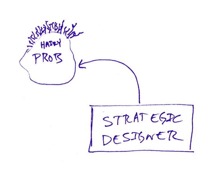
But no, it's not as literal as a hairy McNugget (though that would be problematic). By hairy I meant to imply that the sorts of issues we're concerned with are unclear, they're ambiguous, fuzzy, in motion, and often just hard to grapple with. In short, they're difficult.
The second starting point was the legacy of HDL itself. We had just recently discovereda wealth of photographs and other documents hiding in the archives. In 1968 the first HDL-related event was stylish, but because of its era it was also very paired back, appearing almost minimal to today's eyes. We wanted to evoke this and connect with the lineage of our thinking.
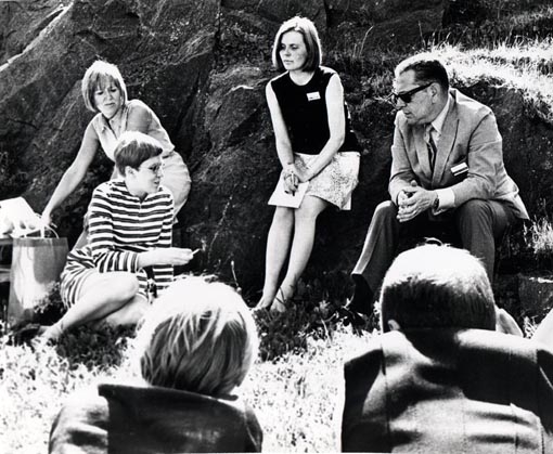
Photos: Kristian Runeberg
Third is the nature of Sitra itself. As an organization that reports to Parliament, Sitra is a serious institution, and our design-related work is no exception. We asked TwoPoints to respect the seriousness of work we were setting out to do by giving it a downplayed visual expression. The result, as you will see, if a visual language that can be rather austere in its most basic applications. We've carefully avoided graphic frills over the years. We've embraced the blank space, the negative space.
After our first meeting Lupi and Martin spent a couple weeks digesting the contents along with Irene Hwang of Constructing Communication, who was also contributing to the project. We asked them to provide us with a style guide that defined a visual language for HDL, including all of the basic such as typography, colors, and a family of layout concepts (expressed as common grids that we use in all documents).
When they finally came back to us, their document, a styleguide for HDL, opened with this:
The driving idea of the visual identity is drawn from the “space” occupied by the strategic framework of HDL, which draws together a diverse group of actors and entities from various fields. These actors, each one a specialist in his field, contributes a unique point of view within a group that can offer a more holistic definition of the problem, thereby creating the opportunity for a more effective range of solutions.
Here you can see the genome of our Studio Model already emerging. The general notion of a collaborative, multidisciplinary, design-led framework is certainly at the core of the Studio, but it's also true of our work in general. So how to express this visually?
In terms of visual representation, this space is filled by heterogeneous visual styles that serve to represent the actors with different backgrounds functioning in a holistic way.
The conceptual framework of this particular visual identity, in contrast to a “normal” branding, avoids homogeneity or uniformity in favor of highly diverse visual styles occupying the same space. Yet, given this embrace of heterogeneity, the visual identity maintains a sense of stability in order that the identity expresses trust, confidence and recognizability.
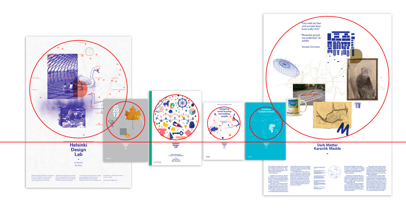
Thus, the visual identity is both flexible and constant. The identity contains two zones: 1) A flexible image space that may house corporate elements or images that illustrate a specific content and 2) The wordmark space. On the following pages we will outline the different applications of the word- and imagemark.
Facing the challenge of representing HDL as an entity that would constantly evolve as we collaborated with different actors and entities, TwoPoints chose to eschew a static logo and instead designed a visual system that is flexible, yet in all of its iterations remains recognizable.
The system is comprised of five key elements:
1. HDL elements. Shapes abstracted from the letter forms of 'HDL'. We always use at least one.
2. Colors. We are relentless in using HDL blue (Pantone 072 or RGB(0,0,120) for the curious) if you haven't noticed, and that's thanks an initial decision up front that we would use 'blueprint blue' in all of our work. The other colors are used for accent.
3. Network elements. These imply connectivity, intersection.
4. A 'composition zone' defined as a space to be filled with image and typography depending on the application.
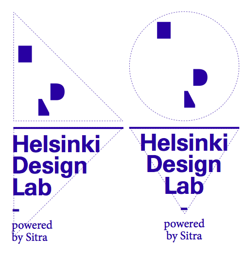
5. Grid logic. Basic rules about how to handle negative space keep the logo system from feeling cramped to squashed.
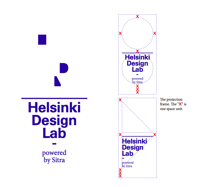
6. Typography. Univers for headlines, Minion for pretty much everything else. No frills.
This set of guidelines provides the building blocks needed to construct a wide range of documents and other visualizations. By spending the time to think about the visual expression—the brand—of our work up front we were able to move quickly at later stages. New publications, new documents, new projects didn't bear the burden of starting from scratch, but they were also not overly-constrained. We had enough freedom to produce a variety of visual expressions that hung together as a family, while each having their own character.
We put this much effort into the visual language of our initiative because that was one low-hanging fruit of differentiation. As newcomers to the market of ideas in 2009-2010 we felt that we would have to stake a claim for ourselves, and while there are a wide variety of very smart people saying and writing very smart things in the communities of social innovation, sustainability, government reform, and the others that we've traveled in, the level of visual sophistication was somewhat lacking.
The ideas are what matter in the end, and I hope the value of our work is determined by the value of nothing other than our thinking and execution. The time we spent on the visual expression of HDL was our way of imbuing what we do with a great deal of care, and in doing so respecting the time and attention that you've given us.
 FREE BOOK about the stewardship and craft of institutional change, illustrated through the stories of six meaningful projects.