While booting up HDL we took some time to build out the infrastructure for our future work. A central part was this website, helsinkidesignlab.org. We've already shared some of the statistics, so this post details how the website came to be and what we were thinking about when we created it.
Have a clear goal
Our goal with the site was to be "a place for designers to come together to learn more about strategic design and participate in the conversation. The HDL site also needs to serve as a resource to government officials, providing information on what strategic design is and how it can help solve their problems."
Make the goal dead simple
We wanted to be the best, clearest, and most dependable resource for information at the intersection of design and government. The primary content we would share is the story of our own evolving work. Secondarily we would highlight the work of others through cases and blog posts.
Get help
Through various engagements over the span of a few months we worked with BERG London to define the strategy for HDL's website; Brain Traffic to edit and hone the message, tone and voice of our core documents (more on this below); TwoPoints to establish a visual language; and XOXCO and Rumors to manifest all of this as the website you're now reading.
The website was my project and prior to HDL I'd spent years working in pretty much every role involved in creating a website, from programming to journalism. So I felt prepared to handle the project, and I also felt strongly that it was important to get help and make sure that the site was done right.
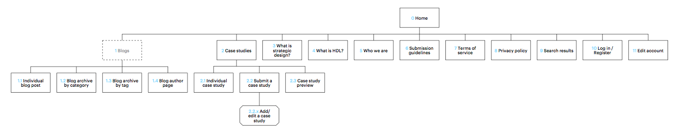
An example from Rumor's work on the information architecture of the site. They started by thinking through the structure of the site before anything was ever designed.
Be conscious of your audience
In a dream world we wanted to be relevant to everyone. Who wouldn't love strategic design?! We prioritized our audiences up front: other designers would be the first, followed closely by civil servants and politicians, and we wanted our materials to be accessible to interested laypeople.
This is the work of content strategy. Get someone smart like Brain Traffic to help you with it. Here's a snippet from their recommendations:
Tone and voice
Because the subject matter is a bit complex and conceptual, clearly clarifying who you are and what you do is important. Your site needs to sound academic, authoritative, and forward-thinking, yet still accessible and personal. Also, because your site operates similar to a non-profit, it should not sound commercial, because you are not selling a specific product or service.
Core messages
These are some core messages your site should convey:
1. Through strategic design, we offer new ways to solve large-scale, global problems.
2. We bring government and design together.
3. We want to advance the strategic design community.
4. We define problems and help deliver more complete solutions.
5. We take the principles of traditional design and apply them in new ways to "big picture" challenges.
Be realistic about the size of the audience
We anticipated that our audience would be relatively small. The percentage of the web audience that is interested in design is small, and strategic design much much smaller. But that's OK: While we have a small audience, they're generally quite committed—and thirsty for camaraderie and content. Building a website for an audience in the thousands is different from working on a website for the hundreds of thousands or millions. For instance, we opted not to invest in building some kind of social network (despite the desire for connectivity) and instead put our focus on publishing content.
A slow website is a nonexistent website
The web is a firehose of content. Lots of it is bad. While it would be nice to imagine that the good stuff will shine through, there's also a basic battle for attention. If you don't post, you don't exist.
We made a commitment early on to post regularly (in the form of weeknotes). This forced us into the habit of regularly documenting what we're doing, and also ensured that there was a steady stream of content on the site. This way the site would not feel abandoned or stale.
Banners? We don't need no stinking Banners!
As a non-commercial site we're able to free ourselves from the clutter that is imposed on most commercial sites by virtue of their banner ads. Helsinkidesignlab.org has a lot of white space on purpose: we want our readers to have a sense of clarity and focus when visiting the site. We don't need banners, so why have them?
Painless posting
Regular posts would not be easy to imagine without a painless interface for posting new content. Although off-the-shelf systems such as Wordpress are cheap, they can also be ill-fitted to specific situations and clumsy to use. We opted to build our own custom content management system using XOXCO's PeoplePods platform.

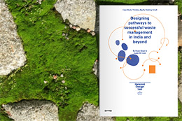 CASE STUDY Rethinking household waste management in Bangalore through strategic design